ADT Project
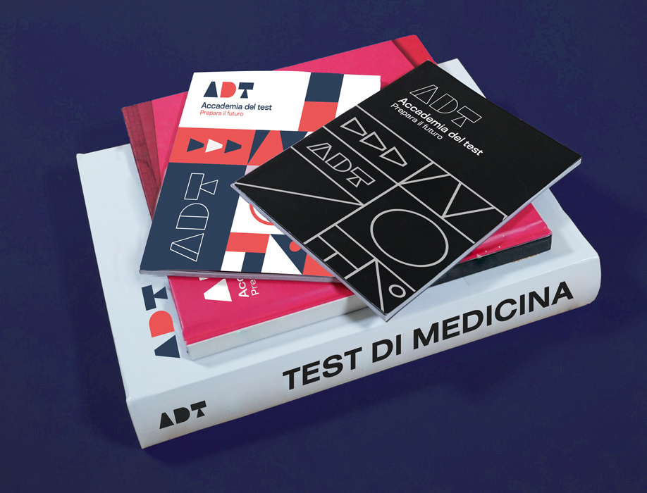
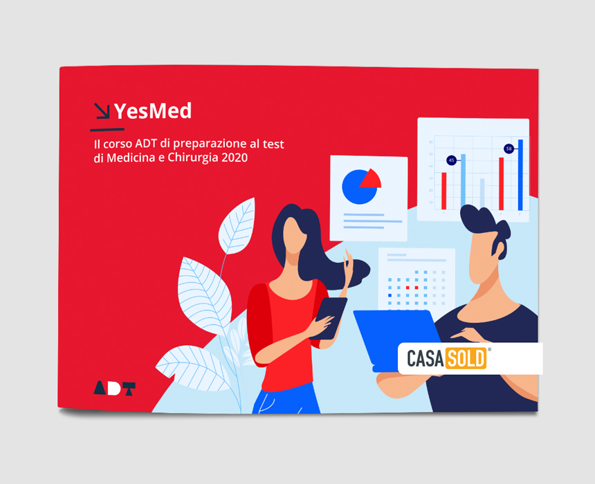
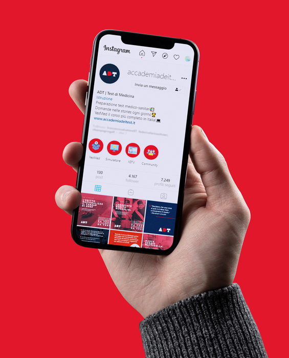
Born as an Online Training Academy, we decided to create a logotype starting from basic shapes as circle, triangle and square. It will give the basics, this is their mission so we created a fluid identity that can adapt on every course they start running. Illustrations and duotones are key for this brand, both on the digital and print stuff.
Client
ADT
Designer
Antonio Morsillo
Date
23 Gennaio 2019


